If you have been around the photography block for some time, I am sure you have stumbled across the term “histogram” by now. Some photographers say that it helps you take better images, some say that it helps you with the exposure settings. Heck it also seems to be omnipresent. It’s there on your camera LCD screen, on the top right corner of your image editing software and perhaps even on your phone by now.
Well, the way I see it, it isn’t of any use to you unless you understand what it represents and employ this new found knowledge to make better judgments, all of which culminates to a better photograph.
Bar diagram, pie charts, histogram, I know it all sounds like a boring Statistics class on the verge of erupting but trust me, this is one of the easiest things to master. And the resultant gain in knowledge will seriously add to the already ever-growing artillery of skill you have about photography by now.
So, let’s get started, shall we?
From The Top
Like always, first what I would like to do is, completely deconstruct what histogram actually is and then explain to you how this piece of graph fits into photography in terms of application. Once you understand both sides equally well, you would have a robust piece of knowledge that you can apply to many things.
Ready? Here we go…
Histogram (The Theory)
Definition: A histogram is a display of statistical information that uses rectangles to show the frequency of data items in successive numerical intervals of equal size. In the most common form of a histogram, the independent variable is plotted along the horizontal axis and the dependent variable is plotted along the vertical axis.
Sounds complicated right?
Let me give you an example and I am sure you will get it then.
Example: Say you are a photography teacher for a class which has 50 students in it. You recently conducted a test and just returned the grades of the students. Here is what it looks like.
| Grades | |||||
|---|---|---|---|---|---|
| A | B | C | D | F | |
| No Of Students | 15 | 20 | 5 | 3 | 7 |
Apart from the fact that seven of your students failed and now you got to explain to the principal why, the students fared pretty well. Most of your students earned the top two grades, congratulations!
One very simple thing that you should understand is, every graph, pie chart, histogram or any other pictorial representation of data is meant to give you a quick overlook of the entire set of data. You glance at it and instantly have a pretty good idea about the underlying numbers, that is the basic idea. It is not meant to make things look complex and hard to interpret.
Here we are dealing with a very small amount of data, just 50 students, and 5 possible grades; but generally, the amount of data that these diagrams have to deal with is far, far more than this (as you shall see by the end of this article too).
So let us make a histogram out of your students and their grades, alright?
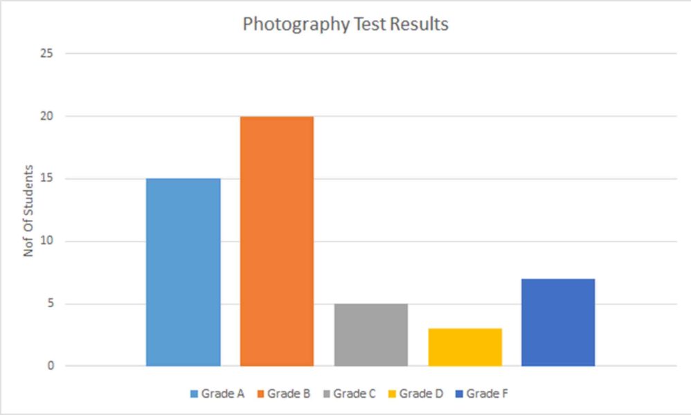
So, basically on the vertical axis, we measure the number of students and on the horizontal axis, we measure the grades. When we plot all the numbers in the table, we get a diagram which looks like this.
Now, just by looking at the graph you can say with certainty that the number of students who achieved ‘Grade B’ was the highest and the number of students who got a ‘Grade D’ was lowest. Wasn’t that easy?
Now go back and read the definition of a histogram that I mentioned just a while ago.
The ‘statistical information’ is nothing but the table of data that we collected from the class result. ‘Frequency’ here means just the number of times a certain thing occurs. So, ‘Grade A’ occurs 15 times, hence its frequency is 15, ‘Grade B’ occurs 20 times, hence its frequency is 20……you get the idea. And we used rectangular shapes to represent the data on a graph. Ignore the dependent and independent variable part, you don’t need that now.
That is all there is to histogram. For all the histograms that you have ever seen in your life. Now tell me wasn’t it easy?!
Now comes the fun part….where I tell you how to leverage the power and knowledge about this simple pictorial representation of data to make better images.
Histogram (Application In Photography)
First things first. You can use the power of histogram to enhance the quality of your photographs in a number of different ways. They include using it while taking images, to using histograms on a post-production software and finally even while printing; but the primary thing we photographers use histograms for is to evaluate exposure.
Exposure
Let me refresh your memory a bit here. Do you remember what exposure is?
In simple terms, exposure can be defined as a specific combination of Aperture, Shutter Speed and ISO settings on the camera which makes the elements of the scene neither too bright nor too dark so as to preserve the visual details in them.
Now how do we ensure that our images are not too bright or too dark?
It is pretty simple, we measure the available light first and then adjust the settings accordingly so as to make a well-exposed image. All DSLR and Mirrorless cameras come with an inbuilt light meter. Whenever you point your camera at a particular scene, the light meter measures the amount of light available and makes the necessary adjustments if you are on any of the Automatic or Semi-Automatic Modes. When on Manual Mode, the camera just shows you the meter reading so that you can make the necessary adjustments.
The histogram is just the graphical representation of the data the image sensor collects. This part is very important and it is the crux of the entire article. Just keep in mind the following:
- We use histograms to assess our exposure
- Exposure is dependent on the amount of available light and the settings of the camera
- The inbuilt Light Meter of the camera measures this available light
- The data collected by the image sensor is what we see represented by the histogram
Histogram For Images
Let us get back to the first example we discussed earlier. We were measuring the grades of the students and the number of students who secured them. This was the very data that we later represented with our histogram….remember?
Now the question is what do we actually measure when it comes to photography?….and what is the data here?
We measure the tonal values of the pixels that build an image and use that information to create the histogram. In this case, think of the tonal values as the grades of the students in the last example and the no. of pixels as the no. of students.
I will explain in just a bit what tonal values are, just hold on for a minute.
Once again, think of it like this:
- Grades -> Tonal Values
- No. of Students -> No. of Pixels
Example
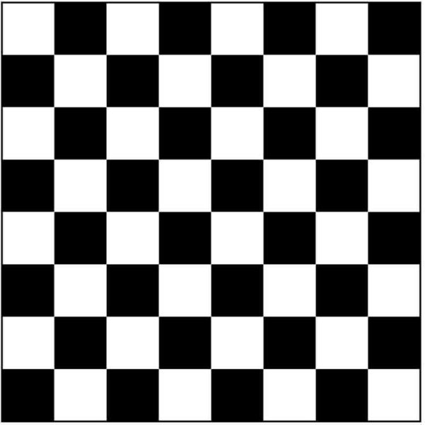
Let me give you an example to clear this out. Let’s say you have a really old camera which can shoot images which has just 64 pixels, no NOT 64 megapixels…..just 64 pixels (yeah you snatched it right out of the paws of a baby dinosaur). Now say you want to take a picture of a chess board.
Just to reiterate, pixels are the fundamental building blocks of ANY digital image. It looks like a square and every pixel contains within itself two key pieces of information, the position of the pixel in the entire image and its colour value. Each and every picture we take today are actually built up of millions of such pixels.
So that you can see for yourself. Open up any image on an editing software and then just keep zooming in. When you cannot zoom in any more, you will see that it looks like a giant grid with various shades of colour in each grid. Each one of these tiny squares is a pixel.
Coming back to the case of histograms now.
Let us say for simplicity that each one of the squares of the chess board is represented by a single pixel. You have 64 pixels on your camera and there are 64 white and black squares on the chessboard. If you now like before, make a table depicting the no. of pixels and colour they are, it would look something like this.
| Black | White | |
|---|---|---|
| No Of Pixels | 32 | 32 |
Looks familiar right? See, now you are getting the hang of it. Let’s keep charging on then.
If we make a histogram, now it would look something like this.
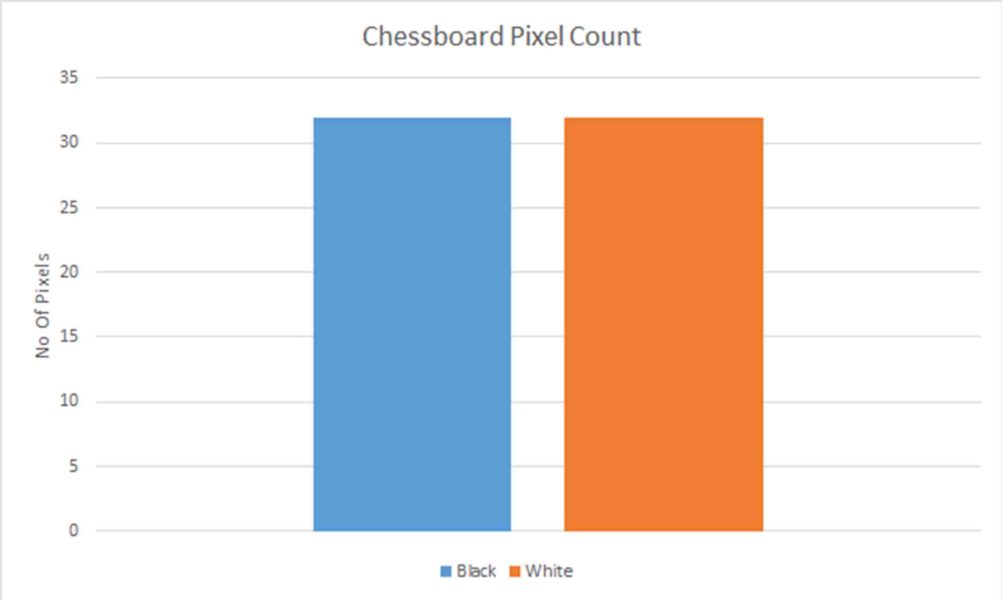
This is exactly the very principle, using which all the histograms about an image is made. All the camera or the post-production image editing software does is count the number of pixels and the values they contain, make a table and finally plot them on a histogram for you to see.
But an average colour photograph contains so much more than just two colours, what then?
That is correct, here comes the concept of tonal values.
Tonal Values
In the chessboard example we discussed right now, there were just two colours of pixels to consider. The choice was always binary, the pixels were either white or black. In real life colour photographs, that is not the case. Even in black and white images, not everything is either black or white. Some parts are a shade darker than perfect white, some parts are lighter than perfect black and then there are just ranges of grey all around.
To account for all the shades of grey in between perfect white and perfect black in a typical b&w image, the various tones of grey are classified and given specific values. There are 256 total number of shades classified under this system.
Zero (0) is the value given to perfect black, and 255 is the value that represents perfect white. All the tones in between is a combination of black and white in various ratios. For instance, 128 is perfect grey. As the values decrease, they get darker and darker and as they increase, they get brighter.
These values assigned to various shades of grey are called tonal values.
Two Very Important Snippets Of Information
There are two primary types of histograms available on cameras and on post-production software. They are:
- Luminosity
- RGB Histogram (Red, Green, Blue)
In this article, we have been and will be discussing the Luminosity histogram only. The RGB histogram is also useful but let’s bundle that up for some other time.
Alright, the two snippets then:
No Light Meter Can See Colour
This might come as a shock to you, but no light meter that is built into a camera can see colour. All it can see and gauge is the intensity of light. So when you point your camera at a certain subject and the camera comes up with a meter reading of the available light, all it is doing is measuring the intensity of the light coming into the camera. The colours of the scene notwithstanding.
This means that your camera light meter always looks at a black and white version of the scene and gives you a reading based on that.
The Camera Histogram is Based on a JPEG Image Even When You are Shooting RAW
The histogram that is shown alongside the image at the back of your camera is actually based on a JPEG version of the same image. I have never seen a camera till today which can produce a histogram in camera that is based off of the RAW data. Maybe the next Sony camera will do it but as of today….none.
Crash With The Real
Now that we have a very sound theoretical background about what histograms are and how they are used in photography, we are going to take up a real-life image now.
How about this one?

Three very jovial people smiling….nice snapshot.
Now try and imagine how the histogram of this image would look like. There are a lot of dark parts in this particular image, like the jacket of the boy and of the girl in the extreme right. The girl in the middle is wearing a trouser which is quite dark too. The background, however, is fairly bright though. Overall in this image, you have parts which are quite bright (the sky) and quite dark (primarily the pieces of clothing). In other words, this is an image full of contrasts. Agreed?
But you forgot a very important factor here!
You just evaluated the image above without ignoring the colour values. Remember I said that no exposure meter can ever see colour? So instead of the image like we see above, actually we should be thinking of the image in monochrome. Something like this:

Now think again.
Although what we said earlier about this image still stands – the dark parts are still dark and the sky is still bright -how we did it earlier wasn’t the correct way to go about it. Whenever you see an image and want to focus on exposure, always think in black and white. The colours simply don’t matter.
Exactly like in the case of your photography class test and the chessboard, what your camera does now is, it takes into account the tonal values of each and every pixel that comprises this image and categorizes them accordingly. There are just two small changes in this case.
- Instead of five categories (the grades, A, B, C, D, F) to subdivide the students into or just two categories in the case of the chessboard, here we always have 256 categories. That is 256 tonal values. So, on the horizontal axis of the histogram, from left to right, the values go from 0 (absolute black) to 255 (absolute white).
- Earlier we always had a small finite number of subjects to categorize. In the classroom example, we had just 50 students. In the chessboard instance, we had 64 squares to play with. With actual images, we also have a finite number of subjects to categorize (the pixels) but they are far larger in number, in millions.
It mainly depends on the camera with which you shoot. So if your camera shoots images at 20 megapixels, you have 20 million pixels to categorize.
Just to bring things into perspective, nothing has changed much from the example we used earlier. Only and only the scale has. Instead of just 5 categories we now have 256 and instead of just 50 or 64 subjects, now we have a few million. The underlying principle is exactly the same.
Resulting Histogram
If you have noticed carefully, the number of rectangular bars in the histogram depends on the number of categories we have. Hence, we had five bars in the first case and two in the second. In a regular picture though, we will always have 256 bars (that is if there are any pixels to classify under that tonal value otherwise there would just be a blank spot).
This is what the histogram of the black and white version of the image above looks like:
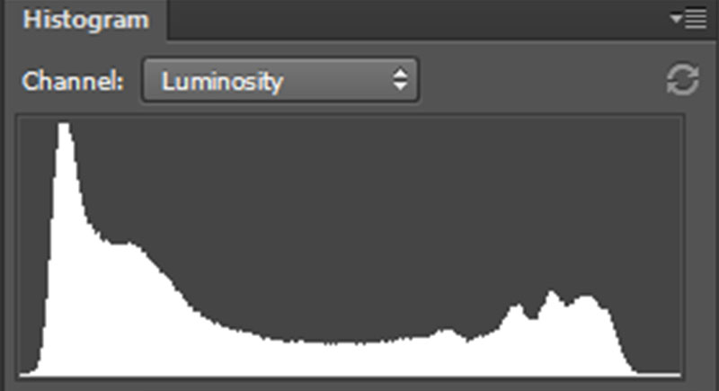
But this looks so different from the ones we saw before!
Yes, that is correct. Earlier just to keep it really simple, so that you are able to grasp the main fundamental essence of the histogram properly, I kept it pretty basic. The graph above looks a little different since it contains 256 bars compressed together with no spaces in between. Just due to the extreme cramming in of the rectangular bars and the sheer number of categories, the diagram above looks much smoother than what we saw before.
Trust me, it is exactly the same thing.
Leveraging The Histogram
Now that you are well equipped with the concept of a histogram, it would be an absolute cakewalk to figure out exposure henceforth. All you have to do is prevent a few things from happening and that would ensure that your images are well exposed every single time.
As you already know, the tonal values are plotted on the horizontal axis. So, from left to right it starts at 0 and ends at 255. If you think about it carefully, that automatically means the first half represents the shadows (dark parts of the image), the middle area of the histogram reflects the mid tones (not too dark nor too bright) and then at the extreme right we have our highlights.
All you have to do to get a well-exposed image is prevent the histogram from hitting either of the walls on the extreme left or right.
Why?
Like everything in life, our cameras also have some limitations. Every camera can capture a certain range of light, beyond which it is simply unable to capture any details and returns either pure white or pure black as the result. The reason why I asked you to ‘stay away from the walls’ is because the walls actually represent those limitations.
Let’s for argument’s sake say that you took an image and now it has 5000 pixels which have a tonal value of 0(zero). This means that all these 5000 pixels will be perfectly black and there would be absolutely no details in them?
But a black object should look perfectly black…what is wrong with that?
Actually, there is. If you shoot a guy wearing a black shirt. Even when the shirt is supposed to look black it does not look like a solid blob of black colour. You can see the threads of the fabric. you can see the texture of the cloth, in other words, it does contain some detail. It isn’t perfectly black.

You see it now?
It is the same story in reverse with the other wall of the histogram. Perfect white, no details.
And that isn’t the worst part yet!
The worst part is once you have under or overexposed the image so much that it has either hit the left or right wall or God forbid beyond (why are you even shooting then?), there is no way to bring it back. No Photoshop, no Lightroom trickery can revive the details from those pixels, ever!
The Silver Lining
If you have been a careful, careful reader, you would remember that I said in the beginning that the in-camera histogram is made up of the data off a JPEG version of the image. That is true even when you are shooting in RAW.
The silver lining therefore is, because JPEGs have far less capabilities to preserve information (in fact it has to DELETE a huge amount and that is how it gets the file size of the image so small), sometimes even when the camera tells you (through the histogram) that you have hit either of the walls and that your details are going to the bin, that is NOT the case always. You may just get lucky, come back home and find that you haven’t hit it quite on your computer.
If you want to know more about the Image File Formats that photographers use and when to use which one, then read this: Image File Format | The Definitive Guide.
Note:
- This ONLY happens when the margin by which you overshoot is really small. Do NOT expect to under or overexpose by three or four stops and expect the RAW files to preserve the details. It is a silver lining, not a magic lining!
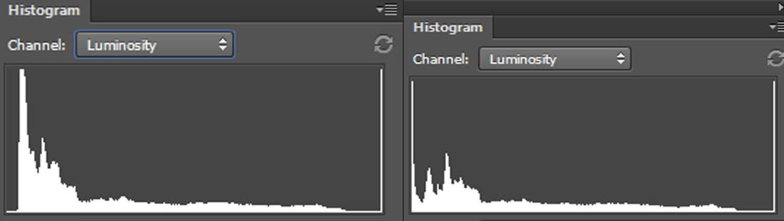
- Although your camera always shows you the histogram generated from the JPEG file, most photo editing software like Photoshop and Lightroom generate the graph from the RAW file (that is if you have shot in RAW in the first place). Hence the difference in the histograms readings, even though they are of the exact same image.
Bonus Tips
- Whenever you are thinking histogram, always imagine the image to be in black and white and consider only the brightness of the pixels. That is all the histograms (in camera) show you.
- While shooting, always expose for the highlights. In digital photography, it is easier to bring back details from darker areas than even mildly overexposed highlights.
- Because the in-camera histogram is based on the JPEG file, try and keep it as untouched as possible. Some sharpness, contrast, and saturation are already added to it by default. Make sure to switch them off. This will give you a more true reading.
- Nearly all high-end DSLRs and Mirrorless cameras have, what is called “blinkies”. These basically highlight the parts of the image which are being clipped off, in real time. If you have them, do use them.
- There is no IDEAL histogram to shoot for. Composition is the thing you should always, always strive for. The histogram is just a litmus test for your exposure.
- Different lenses will have different effects on the histogram, even when you do not alter the settings on your camera and also use the same focal length. For more on this, read up F-Stops and T-Stops and the differences in them.
Finally
If you are already here, I would like to solemnly bestow upon you the title ‘Histogram Nerd’. I sincerely hope that you have already gathered everything there is to know about histograms and its application in photography.
Thank you for reading such a lengthy piece.
If you still have any more questions, please do not bother me with them. I am just kidding, shoot them down below and I will get back to you!
Keep shooting amazing.
Toodles.
relation to a Histogram, is a light meter beneficial or not ??